Quantcast
Channel: The Cartoon Cave
Viewing all 84 articles
Browse latest View live

Send In The Clones

$
0
0

A couple months ago, after much debate, I made the decision to phone in a cancellation order on my cable TV service. That cancellation took effect a few weeks ago, so I am now without TV reception whatsoever. Fact is, I haven't liked what TV has offered for many years now, so I really couldn't justify paying the exorbitant monthly fee for it anymore. There are numerous reasons as to why I no longer enjoy TV, but for now I'm just going to specify one of them. (With more rants to undoubtedly follow!)

Take a look at the DVD cover shots I've posted above of a cross sampling of several current TV dramas. In my opinion, based on these cast pics, they might as well all be from the same show. Note the similarities throughout:

- The cast members are all rather stand-offish from each other, with no interaction among themselves. The poses are pretty stiff, straight up and down (with a few exceptions). They all seem very self aware, caught up in their own presumed self-importance, hands on the hips and crossed arms all geared to intimidate. These cast shots all remind me of the way contemporary rock bands pose in their publicity shots. Ugh!

- Aside from a central figure who may be an older character actor, the ensemble casts are all blandly attractive young hipsters, all obsessed with looking cool and aloof, the young men usually sporting several days of facial hair, the gals all trying to be as badass in attitude as their male counterparts. They all seem so devoid of individual personalities and mannerisms that they are pretty much indistinguishable from each other!

- None of these shows feature real colour. I've posted about this ugly trend of desaturation before, but it's become the default look for all television dramas as well as most dramatic films these days. They all use their silly computers to remove all the natural colour and give everything a blue-grey tinge or tamper with it in various other ways. Additionally, all these shows are as dark visually as they are in tone, with foreground characters kept mostly in shadow, yet being backlit with unpleasant florescent light or strong blue-grey window light. Despite some of these shows taking place in hot, sunny climes, the warm colours of a hot sunny day are never evident.

To be fair, the only one of these shows I've actually seen is Criminal Minds (and a bit of one episode of Warehouse 13, which was wretched), but I'm certain that I've probably witnessed bits and pieces of most of these and numerous other likeminded shows, so I really don't think I'm off-base with my overall assessments. In the case of these contemporary crime dramas like Criminal Minds, CSI, NCIS, etc, they all seem to feature ever more grisly criminal acts shown in nauseating detail. The main characters are all just ciphers, not really personalities at all, every last one of them acting in the exact same manner in every episode, one by one putting in their two cents worth of analytical deduction in those roundtable scenes. And the overall tone of every episode seems to be one of unrelenting grimness!

In contrast, the crime dramas of the 60s and 70s that I grew up with, kept the violent imagery to a minimum, instead building the shows around the charismatic personalities of the detectives, and allowing some light, joyful moments to break up any chance of slipping into grim monotony. Detectives like Joe Mannix, Jim Rockford, and Lt. Columbo seemed far more human and likable than any of their counterparts today. And from the colour and lighting, you knew all three of these particular shows took place in sunny LA!

So, there you have it - the first of what may become several more rants about what television has deteriorated into. Sorry, but that's how this self-confessed curmudgeon feels about it.

Modern Hollywood Hates Real Colour!

$
0
0
Frequent commenter, Ricardo Cantoral, pointed this Blu-Ray box art out to me in the comments on my last post. I am likewise appalled by how lackluster (and plain ugly) the art direction is on this box cover. Especially when you consider how rich the colour was in the original version of True Grit, as evidenced by the still I've included below.


Unfortunately, a lot of recent Blu-Ray releases of classic films from that era are suffering the same fate when it comes to the way the idiots in the various home video departments are choosing to market them to the consumer. It's quite obvious from the way recent films look that Hollywood has turned its collective back on real colour, preferring to sap it all out through digital desaturation technology and replacing it with what amounts to a blue, brown or gold monochrome with a few key areas pumped up with a complementary colour for contrast. I personally find the process ugly and maddening, resulting in me shunning most films released today.

Therefore, I think it's terribly ignorant of modern Hollywood to foist their tasteless choices onto older movie buffs, by way of marketing classic colour films of the glorious past with this repugnant box art. Here are some more examples of this obnoxious trend:
Not only is this devoid of the movie's colour, but look at the lousy composition, with the image cut off in the middle of Ratso Rizzo's right eye!
Though Hitchcock shot this classic caper in vivid Technicolor, it appears that Cary Grant and Grace Kelly are consoling each other over having both been stricken with jaundice!
Judging by what they've done to poor Popeye Doyle here, I think there is more likely a French's Mustard Connection.
And finally, here's one that I find unforgivable. This new seven disc set on Blu-Ray of the films of Marilyn Monroe is being marketed with this washed out black and white still (against a sterile white background), slightly accented with very muted colours, when most of the films in this collection are some of the most gorgeous Technicolor films of all time! I'll probably end up purchasing it for the (presumably) sharp, vivid colour  prints of these great films, but I'll be doing so DESPITE this awful marketing decision on the box art. Seriously, why couldn't they take a cue from the box art of the DVD collection pictured below and present Marilyn in all her Technicolor beauty?


I think I need to clear my mind of all this modern Hollywood tastelessness by watching Marilyn's iconic Diamonds Are A Girl's Best Friend number from Gentlemen Prefer Blondes:


An Honest Mistake...

$
0
0
...At least, that's my opinion, and I'm backing it up with this theory as to what actually happened regarding the recent unfortunate restoration:


Disney Big Figurines

$
0
0
Over on the blog by my friend, Kevin Kidney, longtime Disney artist, Kevin has just posted some photos of the "Big Figs" or Big Figurines that were created over the years for the Disney Catalogue and Disney Stores merchandise. Kevin and fellow artist, Jody Daily did the initial concept drawings for the figures, establishing the pose usually based on a specific moment from the film they appeared in. After that, rotation drawings would be created from the concepts in several views in order to visually aid the sculptor who would be crafting the figure dimensionally out of clay. Kevin has kindly pointed out that I did the rotation drawings for a number of them and, if memory serves, I think this is an accurate list of the ones I had a hand in that are pictured in his post:

Jiminy Cricket (in hobo garb)
Mickey Mouse Club Morty (one of Mickey's two nephews, though it could be Ferdy)
Penguin Waiter (from Mary Poppins)
Pluto
Pinocchio and Jiminy
Minnie and Goofy as Disneyland tourists (Did I do Mickey and Donald as well? I can't recall!)
The White Rabbit 
Dumbo and Timothy
The Three Caballeros

I'd previously posted the rotations for Pinocchio and The White Rabbit a few years ago here. More recently I had posted the ones of The Three Caballeros here.

Here are several of the others that I've managed to find among my files of past Disney work: 


Happy 30th Anniversary, EPCOT!

$
0
0


Today, October 1st 2012, marks the 30th anniversary of EPCOT, the second park to open as part of Walt Disney World in Orlando, Florida. Though I'll always love The Magic Kingdom best of all, EPCOT runs a very close second for me, and I feel a particularly close connection to that park. You see, back on opening day, Oct. 1st 1982, I was gathered along with my parents and sister in the huge crowd of thousands patiently waiting outside the gate, incredibly excited to know that we would be among the first guests to enter this long anticipated new theme park that had such an interesting evolution.

Originally EPCOT had started out to be something far more ambitious, the "Experimental Prototype Community Of Tomorrow", the personal model of an actual working city as envisioned by Walt Disney himself. Sadly, Walt passed away before this grand experiment could be put into motion, and the plan for an actual working and living community was ultimately decided to be too great a challenge for those who were now in charge of running Walt Disney Productions. To be honest, I don't blame them a bit. It would have been a huge venture, fraught with potential problems and financial risk, and without Walt there to guide them they seriously doubted whether they could make it work.  

So instead, they re-envisioned EPCOT Center as more of a permanent World's Fair, a showcase for new ideas in the area to be known as Future World, and a second area featuring a series of international pavilions circling a manmade lagoon to be called World Showcase. I would imagine that the success of Canada's own EXPO '67, that was a keystone of our centennial celebrations built in Montreal, was also a huge influence on how EPCOT Center evolved into the new theme park it would become.

I loved EPCOT in that first visit on opening day, as it was a thrill of a lifetime to see Disney history unfolding before my eyes. I have several favourite memories of that visit, including that first time experiencing The Universe of Energy, where the guests were directed to their seats in the large theatre before a film began on the history of oil formation during the age of the dinosaurs. As the film ended, the curtains parted and, much to our surprise, the "theatre" broke up into a series of huge ride vehicles that then lined up one by one to enter through the curtains into a fog-filled, musty smelling land of life-sized audio-animatronic dinosaurs. Perhaps audiences today are somewhat jaded, but back in 1982 this ride was truly state of the art! 

My other very fond personal memory happened at the finale of The American Adventure show in the American pavilion in World Showcase. Aside from the technical marvel of the very sophisticated audio-animatronic historic figures that told the story of America's turbulent beginnings and evolution, what really sticks with me is what happened during the filmed portion that plays out afterward. As the attraction's theme music swells majestically, images fade in and out toward us of many key moments in the 20th Century. When filmed images of John F. Kennedy, then Martin Luther King appear, there was spontaneous applause from the audience. But when they are followed not long thereafter by Walt Disney himself, the crowd rose to its feet applauding wildly. It was one of those moments where you had to be there to feel the huge emotional response in that theatre.

Two years after visiting EPCOT, I was to begin my own career at Disney, working initially in the Canadian Merchandising Division in Toronto for 6 years, then transferring to Florida to work in Walt Disney World's Marketing Art Department for an additional 4 years. I started in WDW in 1990, and in 1992 EPCOT celebrated its 10th Anniversary. As one of the character illustrators in that department, I was asked to illustrate the article about EPCOT's 10th that was featured in The Disney News magazine. They wanted a painting that would promote the celebration show that took place around The Seven Seas Lagoon in World Showcase, but in a cartoon style featuring the Disney characters. The show admittedly had some problems that would become apparent a couple weeks after its debut. For one thing, it took place at midday, and I have to say that fireworks are not too impressive at that time - more visible smoke than light display against the sunny Florida sky! Additionally, they had performers flying around in para-planes above the lagoon, dressed in Disney character costumes. Though the character heads were constructed of a lightweight mesh, rather than solid fibreglass like the walkaround versions, the pilots found that their vision was still not that great through the coloured mesh, and Disney decided to cancel that part of the show before the possibility of some tragic accident occurring!

I enjoyed doing the illustration immensely, and the article below shows the stages of the creative process in the way an illustration evolves from concept sketch through to final painting:

Miz Diaz

$
0
0

What?! There's still a pulse in this old blog?!
Yeah, it's been far too long since I've updated this thing, but here's something new to put on here as the first post of 2013. I did this caricature of Cameron Diaz for the current Caricaturama Showdown 3000 challenge, though I must admit it's been ages since I last participated in that thing too. Hopefully this entry will lead to some more in the weeks ahead, as I really do need some sort of kick in the butt to get back in the creative groove again.

Anthropomorphism in Animation

$
0
0
In the 1946 Disney animated feature, Make Mine Music, there was a rather delightful sequence called Johnny Fedora and Alice Bluebonnet. It was a terrific example of anthropomorphism - giving human traits and personality to that which is not human. Usually we think of anthropomorphism as it relates to cartoon animals who wear clothes, talk, and walk upright on their two hind legs. But there are plenty of samples of objects that are also brought to life with human traits, like the enchanted clock, candlestick and tea pot in Beauty and the Beast, or the brooms that overwhelm poor Mickey Mouse in The Sorcerer's Apprentice.

But getting back to the film I cited above, here are some stills from Johnny Fedora and Alice Bluebonnet that show what it is that I love about their design and treatment in the animation.


In the stills above, you can see how the two hats really lend themselves to being cast as human "types". Alice has a bow on the back, just as a girl might have a big bow tying up the back of her hair. The rest of the ribbon hangs down gracefully and can be utilized as girlish arms as demonstrated. Also, the lace around her brim suggests a frilly collar on a dress. Johnny is certainly a lot simpler in design, but the eyes exist where there would be the shadowed indentations on a fedora, and the opening of the hat acts as his mouth. The hatband even suggests a mustache, I suppose.


What I particularly enjoy though about Johnny's design is the use of a visual "cheat" - an element that goes deliberately against the rules of 3 dimensional structure (like Mickey's always round ears, for example). In Johnny's case the cheat is in the way his face actually encompasses two separate planes of the hat: the eyes are on the front, while the mouth is on the underside of the brim. Because a drawing is a 2 dimensional representation of 3D form, the artists can easily get away with this optical illusion of the two planes working as one when the hat is tilted up, as in the two stills above. Also, note how Johnny is able to exhibit emotion in the way the brim is pushed and pulled to achieve different mouth shapes, with the eyes reacting accordingly. This is the magic of traditional, hand drawn animation, and one of the reasons I will always vastly prefer it to CG animation, which so often is trying to mimic the literalness of live-action film. Additionally, so long as Hollywood continues to pursue creating these CG films in 3D, such visual"cheats" cannot possibly work as effectively.

This brings me to a subject that is bound to rub some people the wrong way, but I believe the criticism is warranted. Because of the trend in current animated features to try to emulate live-action cinematography, I feel that we're losing the very definition of what it means to be an animated film. My own interest in animation as a young kid was that it was the illusion of a drawing seemingly springing to life upon the screen. That was truly magical to me, and was certainly one of the factors contributing to my love of drawing and hopes to one day becoming a cartoonist. For me, it was always "The Animated Cartoon" - take "Cartoon" out of the equation and I really wasn't that interested. Sure, I liked some stop-motion animation back then, but it was always drawn cartoon animation that intrigued me.

So hopefully you can understand why I might not be particularly impressed with the latest short that Pixar is working on called The Blue Umbrella, which seems like a watered down (so to speak) variation on the classic Disney segment cited above. I came across this teaser clip on Cartoon Brew today and I must say it just leaves me cold. For a start, though it's technically CG animation, it might as well be live-action footage from the way it looks. The animated faces appear merely pasted on, rather than being physically integrated into the umbrellas themselves, and these objects only twist and turn a bit, not exhibiting any of the whimsical "Squash and Stretch" we associate with classic drawn animated performance. In short, this film clip holds about as much charm for me as a typical TV commercial for Kool-Aid, which it sadly puts me in mind of. For the record, I remain equally unimpressed with Pixar's two Cars features, as they also come across as live-action films with some animated elements pasted on top, again exhibiting no exaggeration of form and movement of the various car characters, thus not taking proper advantage of the animation medium.


By the way, I've heard that this short film may be the work of the satellite studio that Pixar set up in Vancouver. If so, it is likely that some of the folks involved in the animation may be former students of mine at Sheridan. Please understand that my criticism is not targeted toward those involved in bringing the film to fruition. My issue with the film is in the concept and art direction that was decided upon by the powers-that-be. Animation that tries this hard to look like its live-action film cousin just isn't really "animation" in the true sense of the word, not in my book anyway. Sorry, but this stuff needs to be said.

Congratulations, World...

$
0
0
...On your new Pope! It looks like we could be in for a fun time ahead!

"Hah! It looks like they fell for it, Stanley!"


Happy 100th Birthday, Marc Davis!

$
0
0

Yes, today marks the 100th anniversary of the birth of Marc Davis, one of "The Nine Old Men", Disney's celebrated group of veteran animators. Andreas Deja has been writing up some great posts on his blog, so I'm not about to compete with that. But I also love and admire the work that Marc did after his career as an animator, when he moved on to design and create many of the best attractions at both Disneyland and Walt Disney World. Attractions such as The Haunted Mansion, It's A Small World, and The Pirates of the Caribbean were all a big part of my childhood in those early years of family road trips from Ottawa, Canada, down to the brand new Walt Disney World in Florida in the early 1970s. Actually, though, my personal favourite attraction that Marc designed was The Country Bear Jamboree, that had its debut at Walt Disney World before also being built for the Bear Country area in Disneyland.

Marc Davis concept art.....

At that time in the 70s, both my Dad and I were big fans of country music, so The Country Bear Jamboree was a well appreciated parody of Nashville's beloved Grand Ole Opry, with its caricatures of familiar character types from that era of country in the form of cartoon bears in various shapes and sizes. To this day I still love vintage country music (although not its vapid pop/rock incarnation as "New Country"), and The Country Bear Jamboree in its heyday remains a favourite of mine. Sadly, I hear that the show has been recently pared down in length by the philistines who currently run Disney, as they feel that they can get more performances crammed in per day in this abbreviated form.

....Translated into the actual show!
On a similar theme, I recall onetime going down to WDW and seeing a diorama with models on display in The Walt Disney Story on Main Street, of a new proposed attraction called The Western River Expedition. This would have been another water based ride featuring audio-animatronic characters, similar to The Pirates of the Caribbean, then only at Disneyland. Sadly, it was never to see the light of day, as they figured that it would be more cost effective to instead recreate the Pirates ride for the Florida audience.

Marc Davis working on The Western River Expedition model

Concept art for the saloon scene
Many years later, I had finally achieved my dream of working down at WDW as a character illustrator in the Marketing Art Dept in 1990. A couple years later in 1992, I took a vacation out to Disneyland to attend a convention put on by The Mouse Club, a fan club not officially associated with The Disney Company. They had quite a roster of guest speakers lined up, including Marc Davis who was to take part in a panel discussion on the creation of several of the Disneyland attractions. I was staying in the Disneyland Hotel where the convention was being held, and as I was making my way to the room where this event was to take place, I luckily bumped into Marc Davis and his wife Alice just as they were entering the hotel lobby. Since they weren't sure where the room was, I gladly offered to escort them there, taking the opportunity to chat with them along the way. 

Western desperadoes!
The room was on the second floor, but Marc, though walking slowly with a cane, did not want to take the elevator and insisted he could make it up the stairway, which fortunately had shallow wide steps. The hotel had recently been renovated, and there had been some panels of park concept art put up as decoration, so when Marc and Alice arrived at the top of the stairway, there facing them on the landing were a series of large panels featuring the above concept art from the never built Western River Expedition with the masked desperadoes on their horses, also comically wearing masks. I'll never forget Marc's reaction to seeing this art he'd created so many years before. He gazed slowly across the panels, then gradually smiled and started to quietly chuckle to himself. I could tell that he was getting some great amusement from seeing his work again and seemed quite touched that it was on display quite large for people to enjoy. I only met Marc Davis that one time, but I'll never forget witnessing that sweet moment with Marc and his wonderful cartoon art. Happy Birthday to Marc Davis, a genuine Disney Legend!

Happy Birthday, James Garner!

$
0
0
James Garner as gambler, Bret Maverick
Again it is my annual tradition to celebrate the birthday of my favourite actor, Jim Garner. For this year's celebratory caricature I've decided to portray Jim in the role that first brought him a large degree of international fame, as gambler, Bret Maverick in the TV series Maverick, which ran from 1957 to 1962. I was too young to know the show when it was originally broadcast and, sorry to say, I don't recall it ever having been made available in the years since in any of the markets where I lived. As such, I must confess that the only episodes I'd ever seen were the handful that were release on a single DVD back a number of years ago.

Happily that situation has now been rectified, as the complete first season of Maverick was released on DVD this past year, with season two due out very shortly. The character of Bret Maverick is a professional gambler and sometime conman, though only conning those whom he believes are deserving of being brought down a peg or two. He is always a champion of the underdog, and will go out of his way to see that an innocent person receives justice. Though a fast draw and crack shot with a pistol, Bret often manages to get himself out of most tight spots on his wits alone. As a gambler, he has learned to read a man pretty well, anticipating correctly what he's likely to do and being able to cleverly bluff his way through a situation as if he were dealing with an inferior poker player. I love the quirkiness of the series, where no character seems to follow the conventions of the traditional TV western. Even some of the baddies may adhere to some code of honour.

Ironically, though I had never seen the original Maverick, it was when Jim reprised the character 20  years later on Bret Maverick that I first became aware of who the character was. It was also on the set of that TV show that I was able to realize my longtime dream of meeting Jim Garner. You can read about that visit to the set on this previous post

Jim Garner is in his 80s now, and pretty much retired from acting, but I hope he knows how many people he's brought great enjoyment to through his numerous film and TV roles. His legion of longtime fans are extremely loyal and still watch him onscreen every chance we get. Incidentally, a special thanks to Robert Howe, who was fortunate enough to have worked on The Rockford Files back in the mid-70s for a couple years, and who has recently written a new book reminiscing on that time, as well as having created an official Facebook fan page dedicated to Jim. If you're a fan too, please check these out!

Happy Birthday, Jim - we love ya'!


Seeing Red

$
0
0
Frankly, I can't see what all the fuss is about regarding the new Merida makeover...

By the way, for those out of the loop, here's the silly controversy I'm referencing regarding a perceived makeover of Merida from Disney/Pixar's Brave. And here's my take on the subject that I had posted on Facebook that I think is worth reposting here:

I must admit I feel that everybody is getting their knickers in a knot unnecessarily about this supposed makeover of Merida. I suspect it is nothing more than a less than faithful final rendering done by an outside illustrator based on a much better and accurate drawing by the talented Jennifer Gwynne Oliver, not a deliberate, insidious attempt to sex her up at all. Part of the problem is that, in order to fit into "The Disney Princess" merchandising program, Merida (like Rapunzel before her) has to be translated from CG to drawing to be consistent with the others. In so doing, some of the subtleties of the design are lost, notably the complex frizzy hair, as well as the need to define her eyes more graphically with an outline.
I think it's fair to say that even the traditionally animated Disney girls have lost some of their likeness as they've been homogenized into a consistent art style for this merchandising program. Aurora in particular has been rounded out more from her original, more graphic design. To be honest, I've never much liked the mentality of "The Disney Princess" program to begin with, as it takes these characters out of context of their respective cartoon universes, as well as away from the unique variety of shapes and sizes of their respective co-stars. It then places them together alongside their similarly shaped sorority in what looks like a Vanity Fair photo shoot, not allowing any of them to acknowledge or interact with each other in any way. Artistically it's a pretty dumb concept, however little girls just love it and, since they're the target market for all the dolls and accessories, I say let it be. Personally I don't give a rat's ass about them being "role models" - that's just a lot of ultraliberal claptrap. 

Happy Birthday,Yvonne Craig!

$
0
0
Happy birthday to Yvonne Craig, perhaps best known for portraying Batgirl/Barbara Gordon on the Batman TV series from the 60s. Being a child of the 60s, I was most definitely a member of the original TV generation, and TV sure was a lot more fun and friendly back then! Batman was probably my favourite live-action show as a kid, and I suspect that Yvonne Craig's Batgirl was my first prepubescent crush. Though quite sexy in her batsuit, Yvonne also played her as very demure and feminine. I thought she was just adorable. 
In later years I would take notice of Yvonne in the various guest spots she made on a lot of other series as well, usually small but memorable roles. Now that I'm enjoying so many of these great shows on DVD, I've been able seek out a lot her guest spots on my favourite series like Mannix and Wild, Wild West.

Here's a montage above of shots of Yvonne alongside Robert Vaughn in One of Our Spies is Missing, one of the several Man From U.N.C.L.E movies that was created by cobbling together episodes of the TV series. I used video reference from this appearance as the basis for my caricature of Yvonne, although the yellow turtleneck I grabbed from some other pics I found of her. 

She was certainly best known for playing Batgirl, but I'm sure many Star Trek fans hold her in high esteem for her memorable role as the green, dancing, slave girl, Marta in the episode, Whom Gods Destroy:

Though primarily a TV actress in later years, Yvonne did do a few movies earlier in her career. Probably her best known movie is the 1964 Elvis Presley film, Kissin' Cousins, in which she and equally lovely Pamela Austin play a couple of cute backwoods sisters who fall for Air Force officer Elvis. Off screen, Yvonne and Elvis were dating at the time.

Yvonne still does a few personal appearances at fan events in tribute to her Batgirl role. I'm hoping that she'll make it to Toronto's Fan Expo someday so I can meet her! Happy Birthday, Yvonne!

RIP Jean Stapleton

$
0
0
So sorry to hear that Jean Stapleton passed away today. Though she was a veteran of stage and screen, she'll always be best remembered for playing Edith, the long suffering wife of Archie Bunker on the 70's classic TV series, All In The Family.

Back when I was a 14 year old kid, I drew caricatures of all four principal characters on the show and sent them to the actors care of CBS studios, hoping they'd receive them. I'm sure at the age I was then, my drawings were not that great, but I was so happy when I got this nice reply from Jean Stapleton sometime later. I think it may have been one of my first celebrity autographs. Anyway, this sweet note convinced me that Jean must be a really nice lady, and I publish it here in loving memory of this fine actress.

Congrats Rowan Atkinson!

$
0
0
Yes, Queen Elizabeth II has just named this man a Commander of the Order of The British Empire. Here he is putting his new title into practice, giving his first order as he commands Teddy to go attack France. But seriously, congratulations to this beloved British comedian who has given us so much laughter through both his Mr. Bean and Blackadder TV series.

In Search of Mermaids!

$
0
0

Me with MeduSirena Marina and her pod of Aquaticats
Two weeks ago today I was down in Ft. Lauderdale, Florida, having succumbed to the siren song of MeduSirena Marina, a real live mermaid whom I had only known up until now through a several year long friendship on Facebook, due to my interest in all things tiki. Marina and her pod of Aquaticats swim every Friday evening at The Wreck Bar in The Sheraton Beach Hotel, right along the sunny shores of Ft. Lauderdale, and I'd long been wanting to meet her in person so I decided to make that my summer vacation destination this year. 
 Prior to driving down, I had done a caricature of Marina and had some prints made up to give to her as a gift, as she's admired my celebrity caricatures for some time and I thought she'd like to see my interpretation of her exotically beautiful visage. I'm pleased to say that she was quite thrilled with it, and in return she not only made sure I got a good seat to watch her mermaid extravaganza, but also offered to play hostess to show me the Mai-Kai, a wonderful A-frame tiki restaurant that has been a part of Ft. Lauderdale's colourful pop culture since 1956.

Here's Marina soon after we arrived at the Mai-Kai holding up the caricature print I did of her in her mermaid guise. Also, I'd asked her to autograph my copy of the recent issue of Bachelor Pad Magazine, in which she was featured on both the cover and in the main pictorial inside. I suspect the magazine increased its subscription sales as a result of Marina's appearance, as she has fast been becoming a cult figure in the retro lounge/tiki scene, appealing to those of us who are nostalgically passionate about mid-20th Century kitsch!
The Mai-Kai features a live Polynesian dinner show with a bevy of beautiful island dancers, and the food and tropical drinks were wonderful too. As a special treat, Marina had invited the members of her Aquaticat pod to join us for the evening out and so we had mermaids, Hina, Kika, and Kami along to add to the fun. This was apparently the first visit to the Mai-Kai for Kika too, so she was quite excited to be finally seeing the show she'd long heard about. But for a middle-aged guy like me, you can imagine how wonderful it was to be the only male at a table of very attractive young ladies, so this evening was most definitely the highlight of my vacation!


From left to right in foreground: lovely Hina, Kika, and Kami
Here I am with two of the performers from the Polynesian show
After dinner and the show, we all headed out to the Mai-Kai's tiki gardens for much taking of photos. The management know Marina well, so they were happy to indulge us lingering there for awhile after all the other guests had headed out. Here's just a few of the pics I took that night:
Marina served on the half shell!
Me with my new flames, Kami and Kika
Kika lets her drink go to her head!
Marina gives some competition to the ship's maidenhead in the Mai-Kai's Molokai Bar
Ah, this is the life I was meant to lead!!
Again, much thanks to MeduSirena Marina for being such a terrific hostess for my visit and making my first trip down to Ft. Lauderdale a memory I will always cherish. I'll definitely be planning a return trip in the next year or two!

Happy Birthday, Vikki Carr!

$
0
0
I think I must have discovered the music of Vikki Carr back when I was about 13 years old. She was my first favourite female vocalist, and still ranks up high on my list of top singers to this day. The first time I saw her was when she was a guest on The Tonight Show. Johnny Carson was off that night, and I remember that the show was being guest-hosted by McLean Stevenson, who was Colonel Blake on M*A*S*H at the time. When Vikki was introduced and came on stage to perform her song, I was smitten. A petite woman with a big powerful voice, Vikki also has one of the warmest smiles I've ever seen. I was an immediate fan and soon set about to collect her LP records.

Any time I noticed in the TV Guide that Vikki was appearing as a guest on a variety or talk show, I made sure I had my trusty VCR set up to record her performance. I still have all those taped appearances, now transferred to DVD for posterity (I hope!) I was also a member of her fan club for many years, and looked forward to the quarterly newsletter. One time in 1979 or so, while reading the newsletter, I was thrilled to learn that Vikki would be appearing in Hamilton as a guest on the show, The Palace, a revival of sorts of The Hollywood Palace from the 60s, that was being produced in Canada and hosted by singer Jack Jones. I talked my parents into a trip from Ottawa to Hamilton for the taping of the show and sent away for tickets.

Before heading out, I had painted a caricature of Vikki and had it framed up in the hopes of finally meeting her. My folks and I went to the box office to make enquiries as to maybe meeting her after the show that evening so that I could present her with my artwork. I remember the woman at the desk being very nice and summoned Vikki's manager to find out if that would be possible. He smiled when he saw the caricature and said they were currently in rehearsal inside the theatre, but thought she might be able to take a break to meet me right then.

Sure enough, he came back with Vikki Carr herself and I was in heaven. She seemed thrilled with the art and gave me a big hug and kiss in accepting it. She was as sweet as could be as she took the time to chat with me and my folks for several minutes before she had to be back on the set. Yep, I was a pretty happy guy at getting to meet this warm, wonderful lady!

As the times were changing, and traditional vocalists were finding it harder and harder to compete with pop/rock types for radio airplay by the mid-80s, Vikki Carr, along with so many others, found her career in mainstream music being severely challenged. Being of Mexican descent and always having proudly maintained a warm relationship with her latin audience, Vikki managed to find new success in concentrating all of her energies on the latin market, releasing many albums of Spanish songs over the years hence. I always felt it was a shame that, through no fault of her own, Vikki came along just as the final wave of the truly great vocalists of our time was being phased out, and quite frankly, the pop music industry has not appealed to my tastes since. I'll continue to listen to my alltime favourite vocalists like Frank Sinatra, Bobby Darin, Peggy Lee.... and lovely Vikki Carr! Happy Birthday to you, Vikki!


(PS: One of the trickiest things in drawing this caricature of Vikki was her hair. I think she's had more different hairstyles over the years than any other woman I know of! This caricature was drawn from a guest appearance she made on The Dean Martin Variety Show in 1971, and as such, the hairstyle may not be her typical look.)

Happy Birthday, Mike Connors!

$
0
0
Yes, Mike Connors celebrates his 88th birthday today, and he's a TV favourite of mine that I've long wanted to pay tribute to. Mike, of course, spent eight years from 1967 to 1975 playing the role of private investigator, Joe Mannix on the CBS hit series, Mannix. Apparently the show was not an immediate hit though, and was in danger of being cancelled if not for the intervention of Lucille Ball, whose production company, Desilu (formed with former hubby, Desi Arnaz) had produced the show. Lucy felt strongly that the series had merit and convinced CBS to stick with it.

The show actually started out a bit differently in its first season, with Joe Mannix working for a technology-based detective agency called Intertect, run by Lew Wickersham, played by the always reliable Joseph Campanella. The huge banks of massive computers utilized by Intertect would seem quaint by today's standard of small desktop computers, but back then it would have been very impressive.

By season 2 however, it was decided that Mannix needed retooling to appeal more to viewers, so Joe was now a private detective operating out of a swanky, Spanish-style office in a well-to-do area of Los Angeles. He also now had a loyal and efficient private secretary, Peggy Fair, played by Gail Fisher. This was notable for that period in the 60s, as Peggy was a young black woman, and race was still a somewhat touchy subject on TV, though things had certainly progressed a lot by then. She was the widow of a policeman friend of Joe's who had been shot and killed in the line of duty, so Joe hired Peggy out of compassion and respect for his friend, and also did what he could to be a surrogate father figure to her young son, Toby. The show was not shy in confronting race issues on several episodes, and I think it did a lot in improving relations, evolving into the more enlightened 70s, where black actors stepped up to play leading roles in their own series.

What I love about Mannix and many other cop shows of the era, is the combination of authority and elegance that the various detectives had. One couldn't help but like and admire such characters as Joe Mannix, Steve McGarrett, or my personal favourite, Jim Rockford, as they were truly heroic and chivalrous men. They were unapologetic modern-day white knights, back before TV started to take a turn for the worse, eventually giving the viewer highly flawed "heroes" like what we have today. Frankly, I like my TV heroes to be good, decent, upstanding fellows, thanks just the same. In future blog posts I plan on paying tribute to more of them!

By the way, this Mike Connors tribute is dedicated to a fellow named Dave J. who had emailed me several weeks ago to request I do a caricature of Mannix, as he's also a big fan of the series. Thanks for the request, Dave - it was my pleasure!

Here is the opening title music to Mannix, a melodic, jazzy number by Lalo Schifrin, who also wrote the memorable theme to Mission Impossible:


Happy Birthday, MeduSirena Marina!

$
0
0

Happy Birthday to my favourite "Fire-Eating Mermaid", the lovely MeduSirena Marina, who performs weekly at The Wreck Bar in Ft. Lauderdale, Florida. I have written about having recently met this lady here in this previous post. Marina is a favourite among all of we fans of mid-20th Century kitsch and especially Tiki Culture!

Here she is in all of her aquatic splendour!

RIP Peter O'Toole

$
0
0

He had a good run, living to the age of 81, but it's still tragic to learn today of the death of one of the most beloved actors of the 60's era, the wonderful Peter O'Toole. Ironically, just a few days ago one of my colleagues from Sheridan Animation and I were talking about O'Toole's films, What's New, Pussycat? and one of my favourites, How To Steal A Million, as we were both big fans. He had incredible style and charisma, and somehow made decadence appear pretty classy on the big screen! Last year I'd celebrated his 80th birthday here at The Cartoon Cave in this post.

So long to a talented and delightful old rascal!

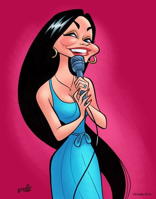
Happy Birthday, Crystal Gayle!

$
0
0

Yes, today is the birthday of that sweet-faced little country girl with the never-ending mane of hair, beautiful Crystal Gayle. Back in the late 70's and into the 80's, Crystal was my favourite female country vocalist. The kid sister of the legendary Loretta Lynn, Crystal was born Brenda Gail Webb, but received her stage name courtesy of Loretta, who got the inspiration for that moniker from the Krystal hamburger restaurant chain!

Loretta actually wrote many of Crystal's first songs, but they didn't really go anywhere, although I must admit I quite love her first single, I've Cried the Blues Right Out of My Eyes. That title may have been prophetic though, in that Crystal had her biggest success just a few years later with the similarly titled, Don't It Make My Brown Eyes Blue, a massive crossover hit that did big business on both the country and pop charts.

Crystal has a great range of music styles, not just country. She loves jazz standards and broadway showtunes from the "Tin Pan Alley" era, and late in her career she recorded a beautiful album of the songs of Hoagy Carmichael, a composer she admired very much. She'd first sung a medley with ol' Hoagy on a country TV special, seen here. Looks like Hoagy adored Crystal right back!

But Crystal is always going to be remembered best for the aforementioned Don't It Make My Brown Eyes Blue, so here is a prime rendition from a concert that first aired on HBO in 1982:


Incidentally, January 9th is not only Crystal Gayle's birthday, but also is the birthday of my dear Dad, John Emslie, who passed away in 2001. Both Dad and I were huge country music fans back in the 70's/80's, and I have many fond memories of seeing a great many of our favourite performers in concert halls and big outdoor summer jubilees together. He was a wonderful father who did so much for me and my sister, and we will always miss him like crazy. So here's a Happy Birthday to you too, Dad! :)


Viewing all 84 articles
Browse latest View live